---
# COVID-19 Scenario in India: A Data Scientist’s Perspective (Part 2)
**URL:** https://www.sigmoid.com/blogs/covid-19-scenario-in-india-a-data-scientists-perspective-part-2/
Date: 2020-07-04
Author: Sigmoid
Post Type: post
Summary: The initial effect of COVID-19 in India has been relatively low in comparison to other countries that we’ve analyzed in the previous...Read More...
Categories: AI/ML
Tags: Cloud Transformation, Data Management
Featured Image: https://www.sigmoid.com/wp-content/uploads/2023/11/COVID-19-Scenario-in-India-A-Data-Scientists-Perspective-Part-2-banner-opt.jpg
---
The initial effect of COVID-19 in India has been relatively low in comparison to other countries that we’ve analyzed in the previous blog where we covered [Global COVID-19 Scenario](/blogs/global-covid-19-scenario-a-data-scientists-perspective-part-1/). This can be attributed to aspects like early lockdown, testing rate, population and environmental factors, among others. In recent times however, the number of cases in India have been on the rise due to the relaxations during the recent phases of the lockdown.
In this part 2 of the blog, we see how [data science and analytics](/blogs/role-of-data-analytics-in-cpg-companies-in-the-covid-era/) can throw some light on the following topics to get a data scientist’s complete perspective about the [COVID-19](/blogs/role-of-data-analytics-in-cpg-companies-in-the-covid-era/) scenario:
- Current global and Indian overview
- State level analysis and deep dive
- What was the impact of the lockdown in India and how did the outlook of the disease spread change during all the 4 phases of it.
- Application of the SIR model for India
- Forecasts for India and the top 5 states
## Global – Overview
Here’s a pattern of the global rise in confirmed and recovered cases, along with the death count that have resulted from this pandemic:
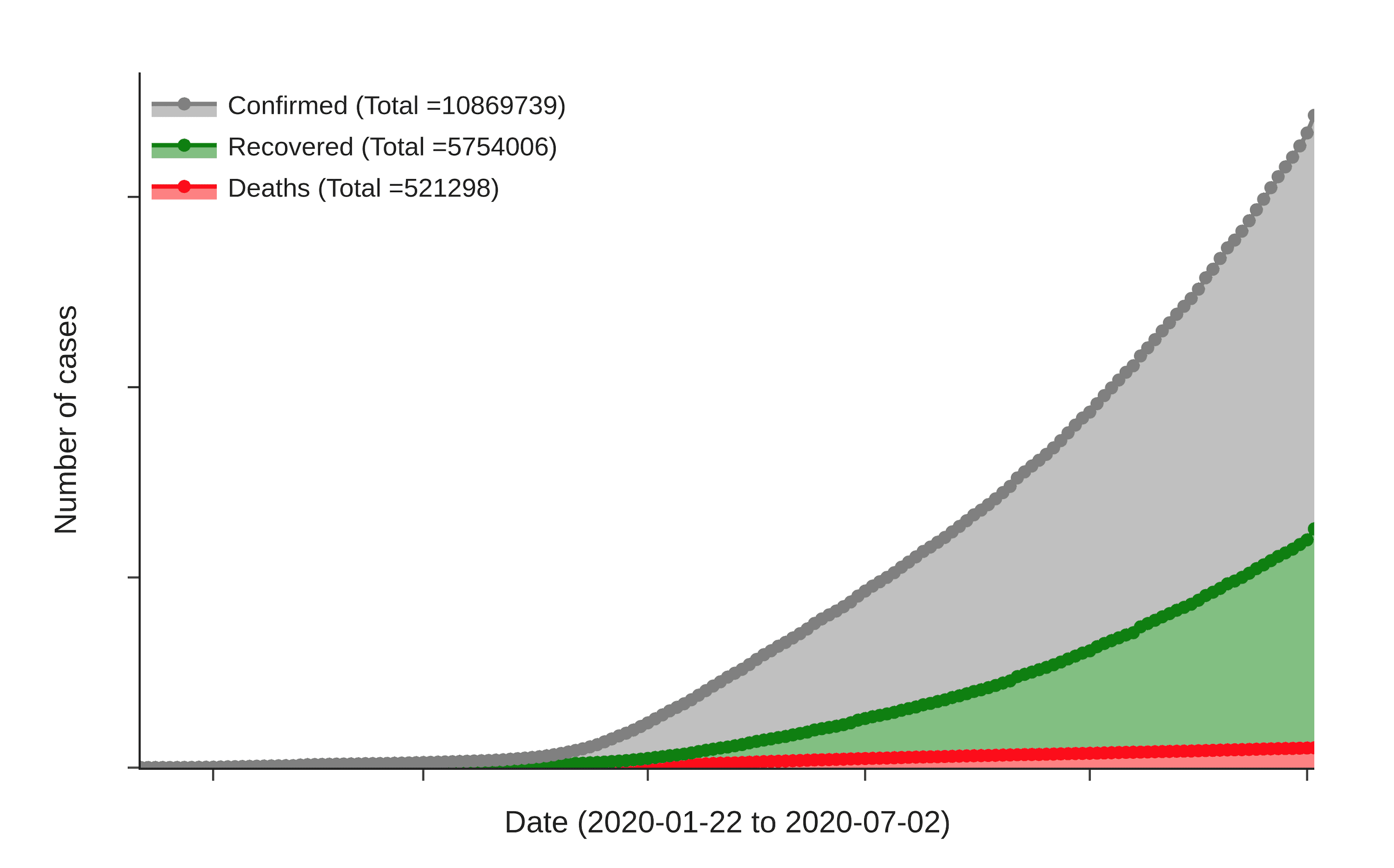
Figure 1: Global Covid-19 Scenario
Using the available data, we’ve put together a tabular comparison of the current scenario across various countries, and how India fares in the fight against COVID-19:
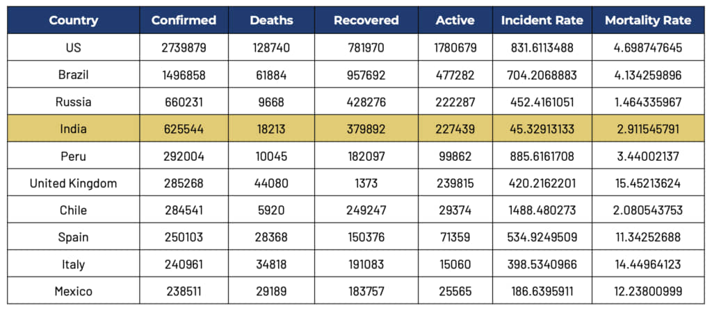
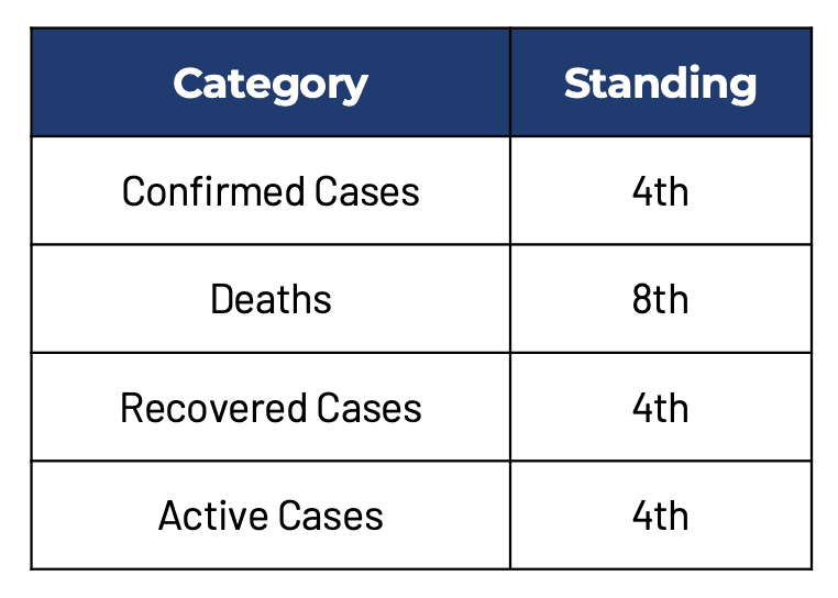
Let’s have a look at India’s standing in the world in these different categories:
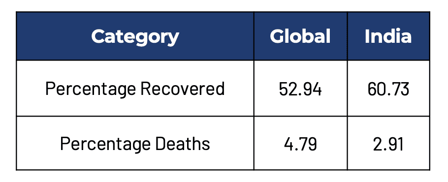
Comparing the percentage recovered and deceased cases:
India – Overview
The following graph shows India’s pattern in confirmed cases, recovered cases and deaths with time:
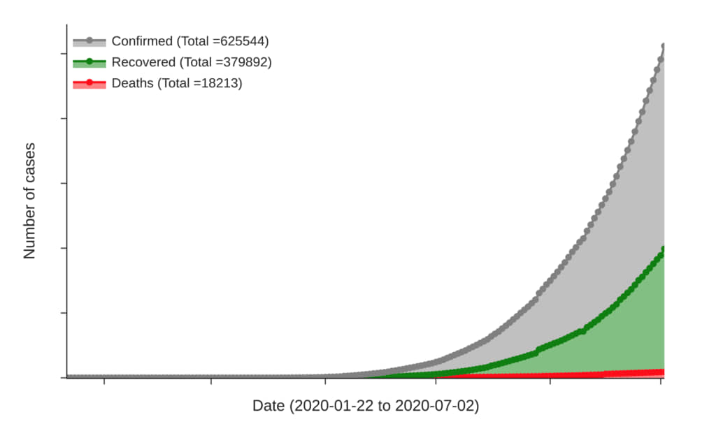
Figure 2: Indian Covid-19 Scenario
Since the end of India’s lockdown 4.0, the number of confirmed cases are creeping up at a steady pace. However, India has also improved its testing rate that has resulted in more than 50% of the cases recovering from the disease.
COVID-19 Transmission in India
Log scale (Total confirmed Cases) on y-axis:
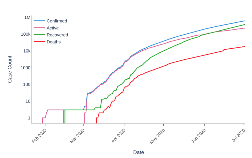
Figure 3: Semi-Log graph for Covid-19 Transmission
In the above semi-log plot of the number of confirmed cases, it can be clearly seen that the number of cases were exponentially increasing in March. However with time the growth rate decreased, vindicating the decision for enforcing early lockdown restrictions.
Recovery and Mortality Rate over Time
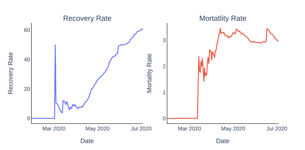
Figure 4: Recovery and Mortality Rate over time
It can be seen in the recovery rate plot, there was a sudden spike initially. There weren’t many reported confirmed cases and this could be attributed to the many points like it was just the start and we were getting prepared for it. The main reason however, was that the testing rates were very less for a country with such a large population. The same can be seen in the mortality rate plot’s initial spike as well. With time, we improved our testing rate and the impact is seen on the reported confirmed cases and number of cases recovered(or recovery rate) with a controlled and decreasing trend in mortality rate over the past few days.
Daily Increase in Number of Cases (Confirmed, Recovered and Death)
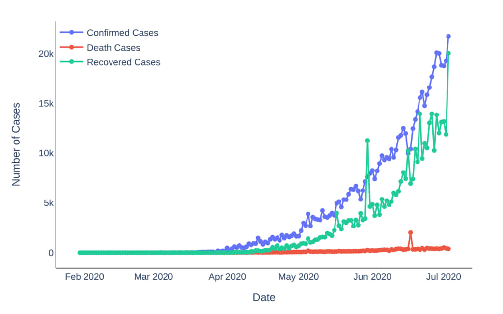
Figure 5: Daily Increase in Number of Cases
The daily increase in the number of cases went up-and-down, with no clear pattern initially. The number of tests conducted on samples were also less. With time as the testing rates improved, the confirmed cases also grew almost exponentially. In the last few days, we can see that India has done a good job by improving its recovery rate.
## State-wise Analysis for India
The situation of different states across the country has been highly variable with few states getting affected badly and few have controlled the situation very well. This can be attributed to the execution of lockdown guidelines and few additional decisions taken by the state governments apart from sticking to the guidelines provided by the central government.
Trend of confirmed cases in all states/union territories over time
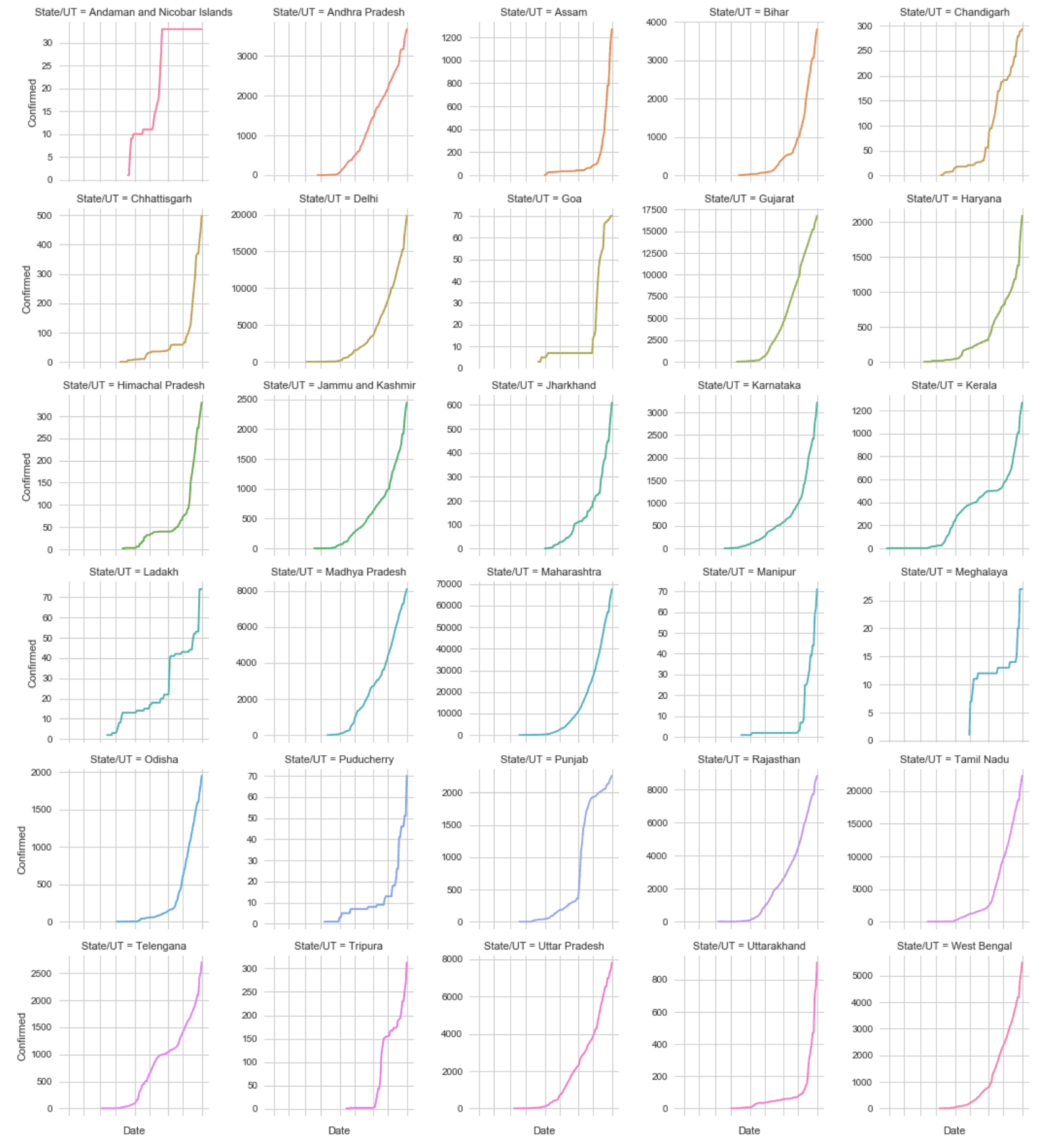
Figure 6: Trend of confirmed cases in different States/UTs
The other states/union territories which haven’t been covered in the above graphs have fared relatively well. Sikkim has 101 total confirmed cases out of which 52 have been recovered till date, Mizoram has 162 total confirmed cases till date and only 126 has been recovered, Arunachal Pradesh has 232 reported confirmed cases and 71 have been recovered, Dadra and Nagar Haveliand Daman and Diu combined have a total of 254 confirmed cases out of which 112 have been recovered, and Nagaland had no confirmed cases till 24th May, but now it has 539 reported confirmed cases, with 197 recoveries till date.
Leading State/UT in each category
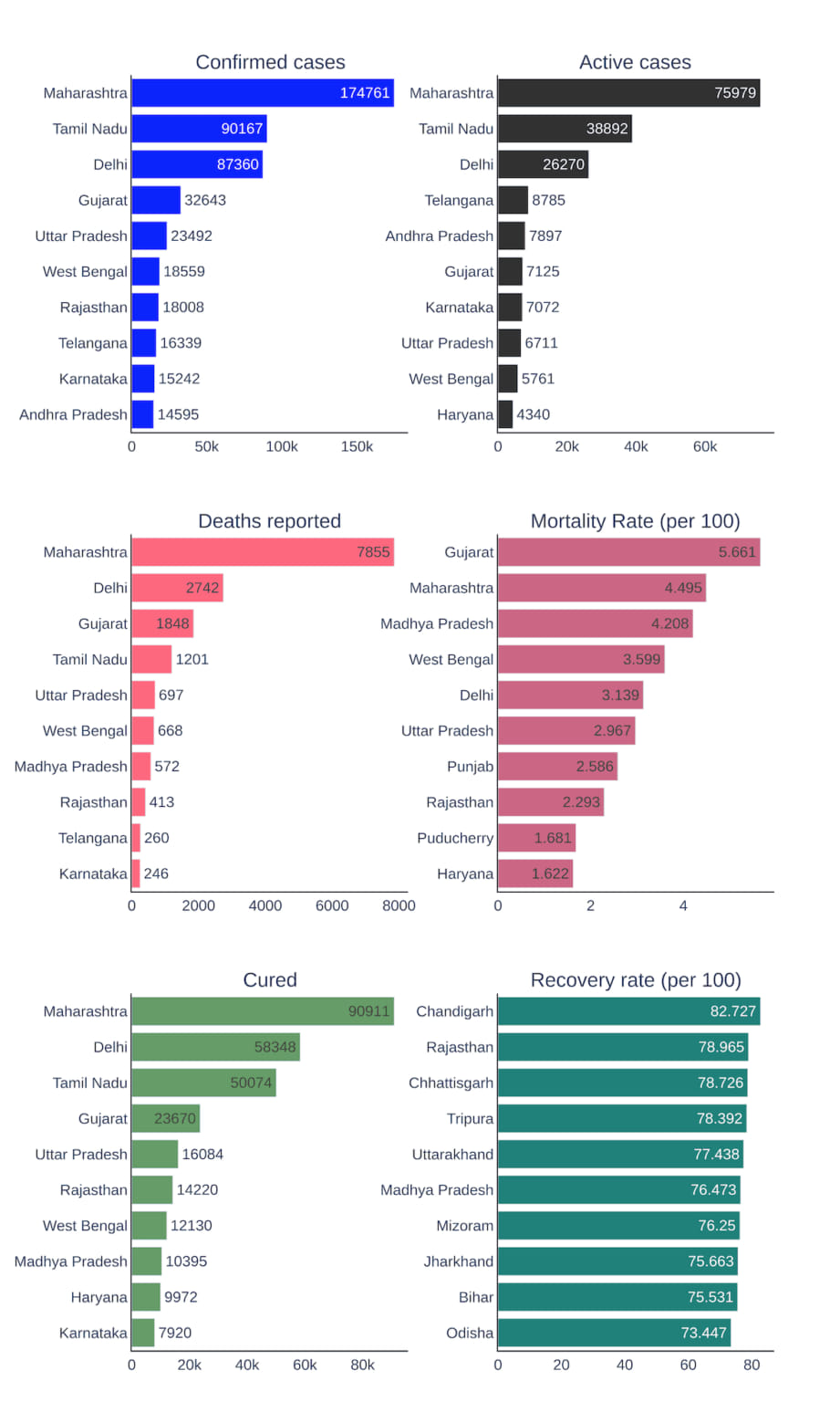
Figure 7: Category-wise Comparison of top states
Top 5 affected states in India are Maharashtra, Tamil Nadu, Delhi, Gujarat and Uttar Pradesh. Chandigarh has the highest Recovery rate of **82.73%** whereas Gujarat and Maharashtra have the highest Mortality rate of **5.66%** and **4.49%** respectively.
7 day Moving Average of increase in confirmed cases for top 10 states
The most popular term “flatten the curve”, is visible through this 7-day moving average analysis. The curve flattens only when the number of new COVID-19 cases show a downward trend in the number of daily new cases. A similar analysis for the most affected countries across the world is here along with the details of how it is done and the benefits of this analysis.
The charts below show the daily number of new cases for the 10 most affected states in India. It is evident that very few states could flatten the curve and the others still have shown exponential growth.
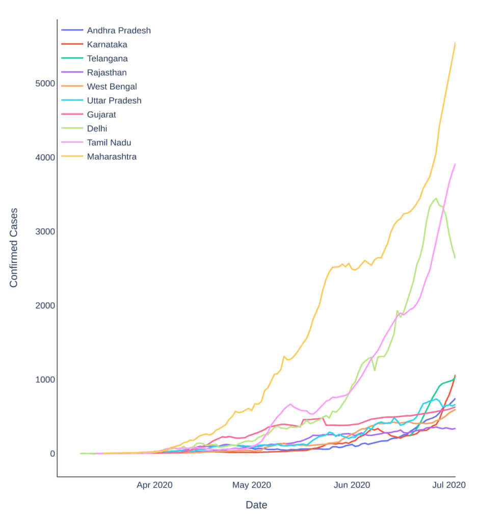
Figure 8: 7 Day Rolling Average of Daily increase of Confirmed Cases
Timeline of COVID-19 Spread in India
## Indian Scenario in different Lockdown Phases
We shall now compare the COVID-19 status in each of the 4 lockdown phases to judge the effectiveness of the early restrictions.
Lockdown Phase 1 (March 25 to April 14)
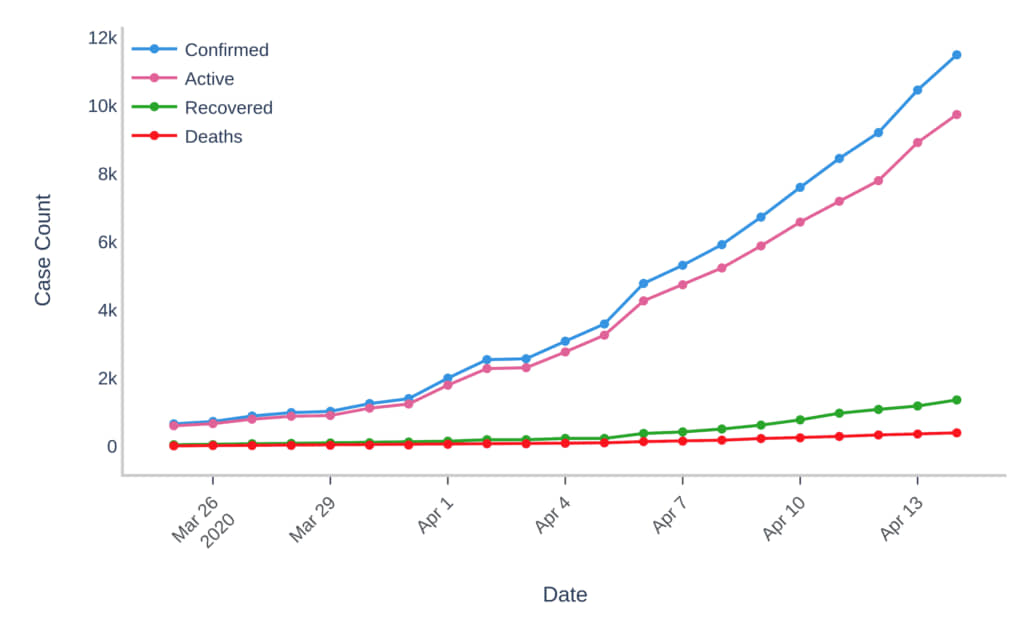
Figure 9: Covid-19 Scenario during Lockdown Phase 1
Lockdown Phase 2 (April 15 to May 3, 2020)
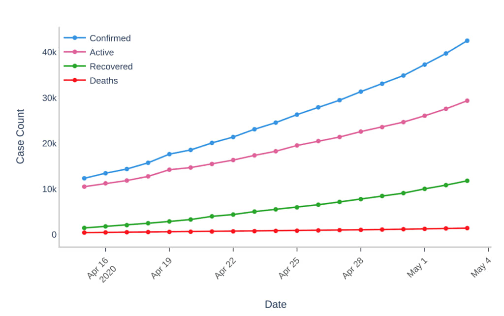
Figure 10: Covid-19 Scenario during Lockdown Phase 2
Lockdown Phase 3 (May 4 to May 17)
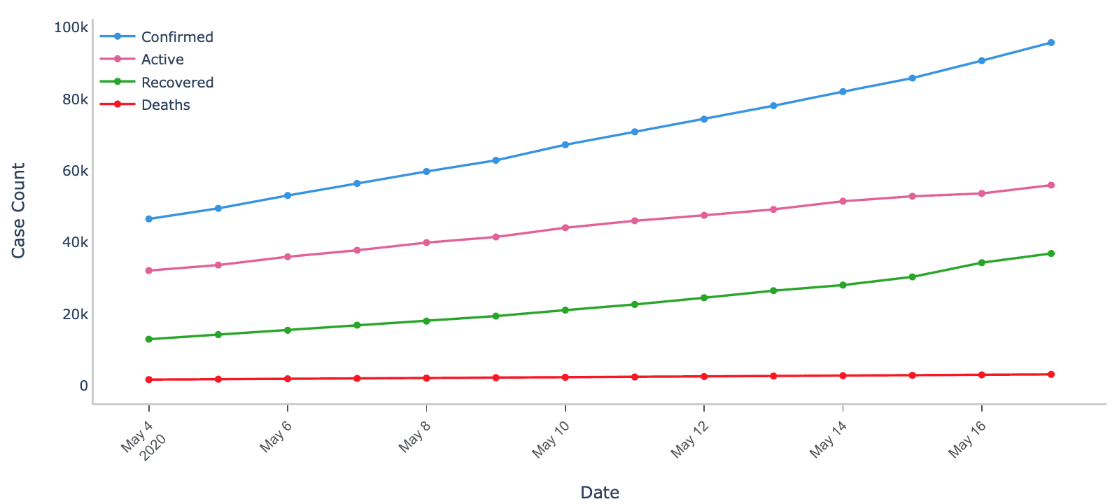
Figure 11: Covid-19 Scenario during Lockdown Phase 3
Lockdown Phase 4 (May 18 to May 31)
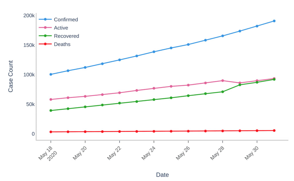
Figure 12: Covid-19 Scenario during Lockdown Phase 4
Analysis of the 4 Lockdown Phases:
- The lockdown was introduced towards the end of March, when the confirmed reported cases had begun increasing at an exponential rate. This was a sudden decision after the one-day lockdown (‘Janta Curfew’) imposed on March 22, 2020.
- Phase 1: With an increasing number of confirmed cases, several instructions were given to the society to follow. Many people didn’t follow the guidelines effectively, leading to an increasing slope of confirmed cases. Also, the recovered cases were less as it was the preparation phase.
- Phase 2: Positive signs during this phase as the rate of new confirmed cases was lower and the number of recovered cases started increasing with a good rate as compared to the last phase.
- Phase 3: The trend of the number of confirmed cases with days almost became linear
- Phase 4: The linear trend of the confirmed cases count continued, with a very good increment in the recovery rate, that can be seen in the plot where nearly half the confirmed cases recovered and we only had a mortality rate of around 3% towards the end of it.
The decision of an early lockdown has worked for India in some ways. Initially, when this pandemic had badly hit some countries in other parts of the world, the lockdown in India ensured at least the vast majority of the population who followed the rules and stayed indoors were safe. In parallel, the country got some crucial headway to build resources, slowly improve testing rate over time, arrange different quarantine centers and spread awareness among the masses to fight the pandemic.
## Scene After Lockdown:
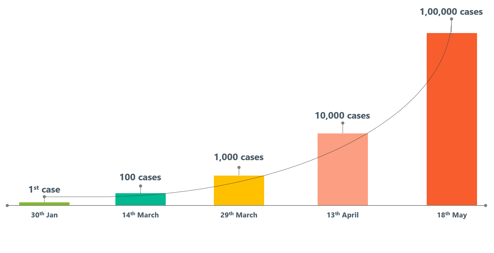
As we are all aware that things have been very hard for some of us in the Lockdown phase which continued for quite a long time than what we all had thought of and we all kept ourselves patient thinking that things would be back to normal soon. So in the start of June, 2020 lockdown was waved off in most of the parts of the country with the highly affected zones still under lockdown and constraints. Government termed it as Unlock 1.0, which saw a record increase in either the number of reported confirmed cases or the deceased cases. And recently Unlock 2.0 was introduced, starting from 1st July, 2020.
In Unlock 1.0, Day 1 increase in the number of reported confirmed cases was 9399, with approximately 12K cases coming in a day by mid-June, ending the phase with 20K plus cases registered on a single day on 28th and 29th of June. This phase also had a huge peak in the number of deceased cases on 17th June 2020 with a number of 2003 deaths on a single day. After that India has seen a declining curve for the mortality rate by each passing day.
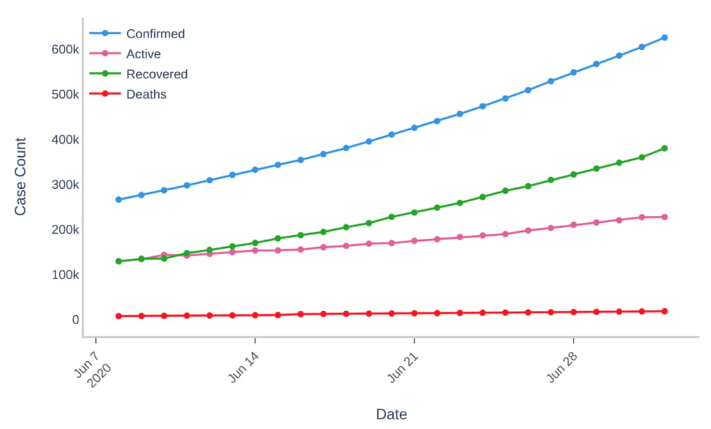
Figure 13: Covid-19 Scenario during Unlock 1.0
Unlock 2.0 has just started with 18742 reported new cases on its very first day and 19231 on the second day with a recovery rate of more than 60% and a mortality rate of less than 3% on its second day.
## SIR Model Application
Application of SIR Model on the [csse_covid_19_time_series](https://github.com/CSSEGISandData/COVID-19/tree/master/csse_covid_19_data/csse_covid_19_time_series) dataset.
Modeling and Prediction:
- Since there is an exponential rise in the number of COVID-19 cases, not only can we try to fit the data to an exponential curve, but we can also try predicting the cases in the near future. People have normally used Compartmental Model techniques to model infectious diseases. The same can be used to model COVID-19 as well. The simplest compartmental model, SIR, consists of three compartments: S(susceptible), I(Infectious), and R(recovered or deceased or immune).
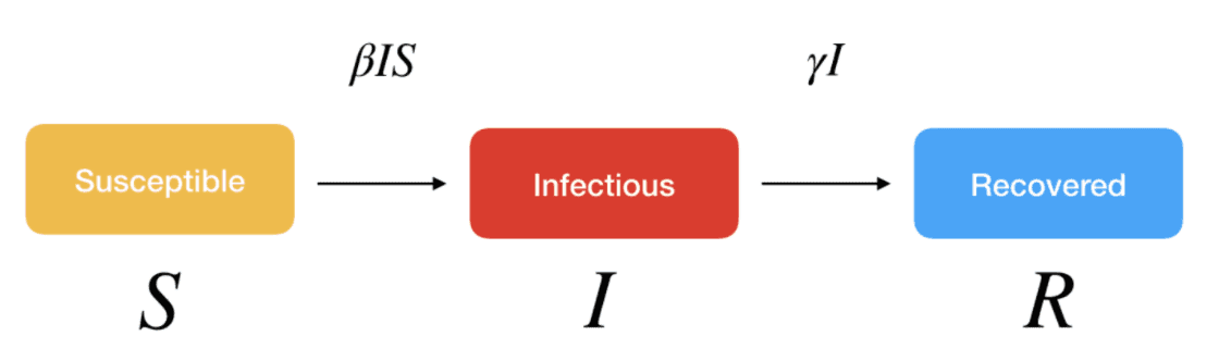
Figure 14: SIR Model Components
where ???? and ???? are the parameters.
- By Simulating the model with 2 Million susceptible cases, the outcome of prediction after fitting a SIR model for India shows the following result
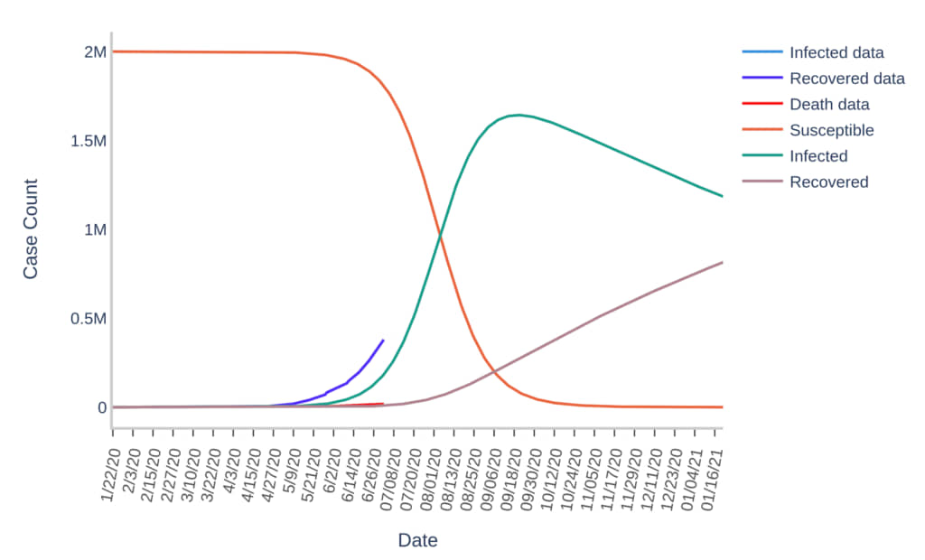
Figure 15: SIR Model Prediction for India
- This model shows the time taken by the country to recover most of the infected people, by taking into account the current recovery and mortality rates. As per the model, the peak(maxima) for infected people is predicted on September 20th, 2020.
## Forecasting the COVID-19 cases in India
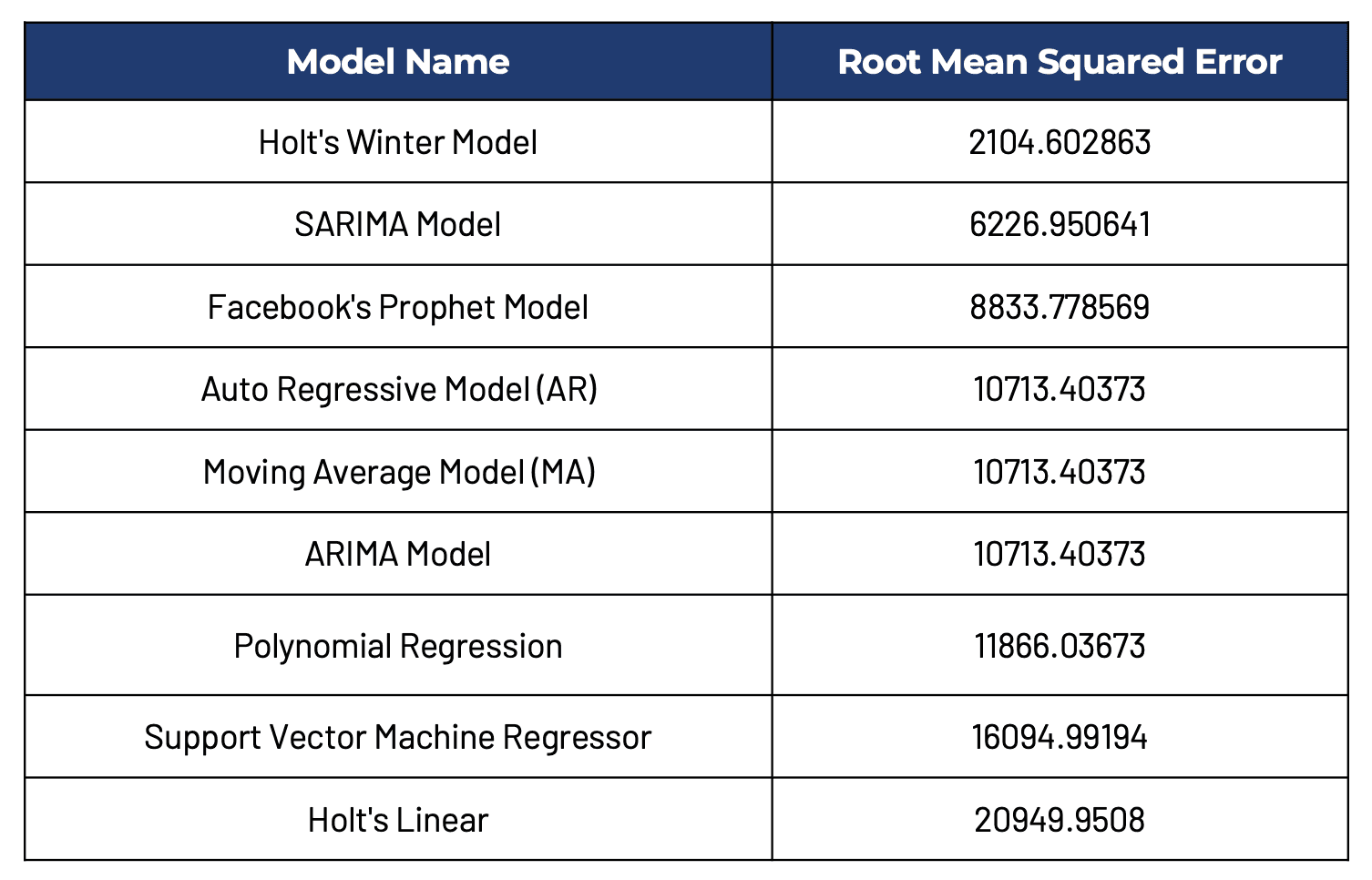
To forecast the cases in the upcoming fortnight, we’ve applied ML models and time series forecasting models. The ML models used are Polynomial Regression Model and Support Vector Machine Regression. The time series forecasting models used are Holt’s Linear model, Holt Winters Model, Auto-Regressive (AR) Model, Moving Average(MA) Model, ARIMA Model, SARIMA Model, and Facebook’s Prophet Model. In the above-listed techniques, the modeling was done on 95% of the data available and validated on the rest 5% of the recent data. The metric used for judging the models was RMSE (Root Mean Square Error).
We tried predicting the trend, first for India, and then for the top-5 affected states in India. For all regions, the best results (metric value) were obtained from the Prophet Model and the forecasted values are plotted in the figures below.
The RMSE scores of the models trained for the whole country are:
The best-selected models for the top 5 affected states:
Forecasting – India
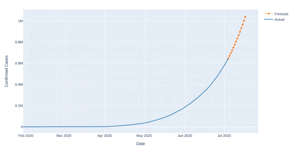
Figure 16: 14 Day Forecast for India
The COVID-19 cases in India are likely to increase by 67.68% in the next 14 days!
*Covid impact estimates change frequently, the intent here is to showcase the capabilities of techniques used.
Forecasting – Top 5 Affected States in the next fortnight
- Maharashtra: The COVID-19 cases in Maharashtra are likely to increase by 41.54% in the next 14 days
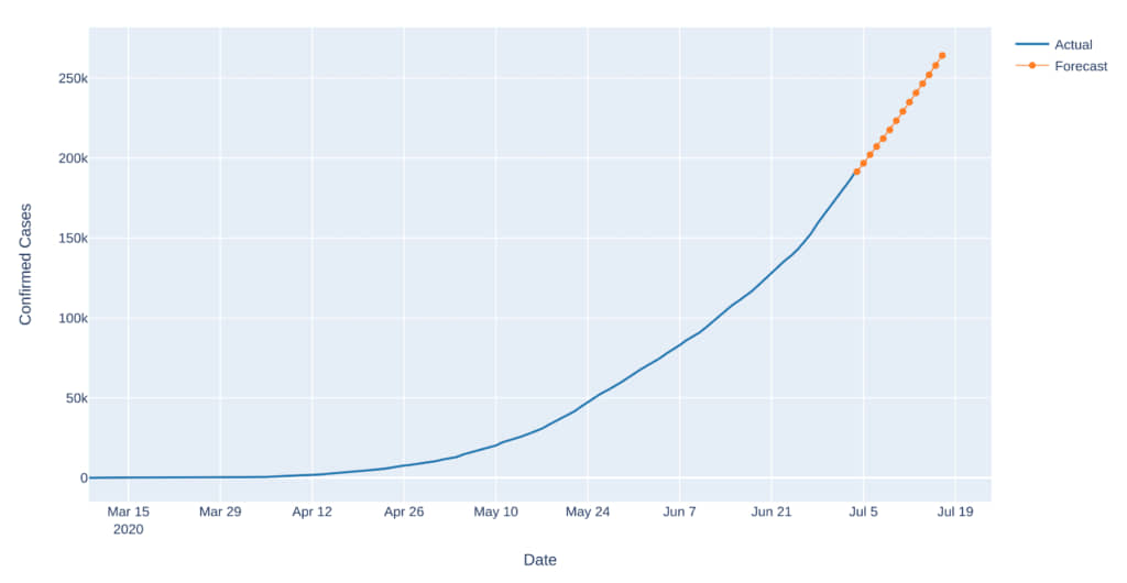
Figure 17: 14 Day Forecast for Maharashtra
- Tamil Nadu: The cases are likely to increase by 56.94% in the coming fortnight
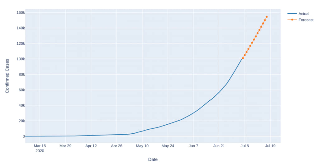
Figure 18: 14 Day Forecast for Tamil Nadu
- Delhi: The cases are likely to increase by 68.35% in the next 14 days
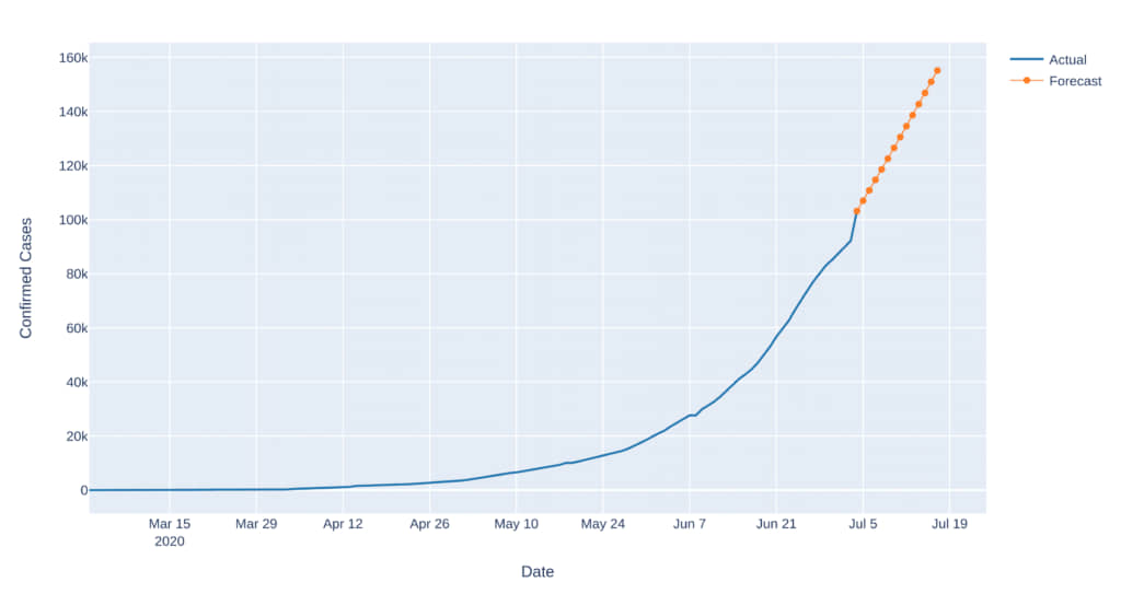
Figure 19: 14 Day Forecast for Delhi
- Gujarat: The cases are likely to increase by 23.77% in the next 14 days
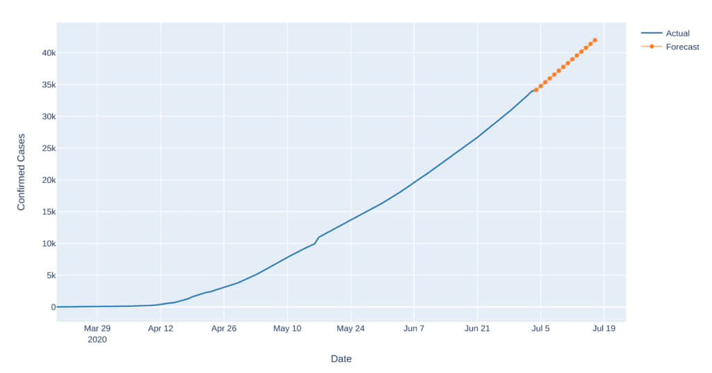
Figure 20: 14 Day Forecast for Gujarat
- Uttar Pradesh: The cases are likely to increase by 74.19% in the next 14 days
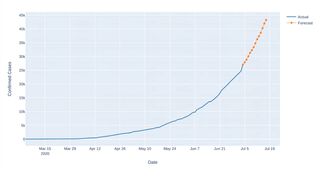
Figure 21: 14 Day Forecast for Uttar-Pradesh
## Conclusion
In the early days of the pandemic, some people were grateful that the pandemic didn’t originate from India, or at least the positive cases here were observed much later compared to the other countries. But we know that no country was actually prepared to combat a pandemic of such scale. The decision of an early lockdown was rightly taken as it would have been nearly impossible to curtail this exponentially increasing curve of cases and the impact would have been disastrous for the subcontinent.
As people continue to discuss and debate on different courses of action and how things could have been handled better based on their gut feeling, data science and analytics -backed with solid research and evidence, throws light on insights that often go unnoticed. From the above sections, we see that the lockdown decision was fruitful as far as numbers are concerned. We were successful in converting the exponential growth to almost linear and it also stopped the spread in many of the states as well. And now that the lockdown orders have been relaxed in some states, preparing for “Unlocking Phase-1” from 8th June, people have slowly begun stepping out of the houses and are looking to resume their usual activities. The curve of confirmed cases will be steep as we anticipate, but the high recovery rate should keep the number of active cases under control.
The number of reported new confirmed cases are taking a spike almost every other passing day after the lockdown has been waived off, but as this lockdown at least provided us with time to be prepared for dealing with this pandemic, the recovery rate has reached more than 60% in the nation which has only been possible because of all the front line warriors fighting for us to be safe. We Salute them and hope that in the coming month or two, the situation will be better and the number of active cases will go down. In the best interest of our fellowmen, it is highly recommended that everyone stays home, stay safe and follow the rules for their own and the society’s well being.
## References:
- [Global COVID-19 Scenario: A Data Scientist’s Perspective (Part 1)](/blogs/global-covid-19-scenario-a-data-scientists-perspective-part-1/)
- [Python script for the Analysis](https://github.com/raniruddh/Covid-19-Analysis-Visualizations-and-Predictions)
- [JHU Moving Average Analysis](https://coronavirus.jhu.edu/data/new-cases)
- [JHU Data Lin](https://github.com/CSSEGISandData/COVID-19/tree/master/csse_covid_19_data/csse_covid_19_time_series)
*The analysis and the numbers shown are based on the data available till 3rd July,2020 15:00 IST.
## About the Authors
Aniruddh Rawat is a Data Scientist at Sigmoid. He works with data and application of Machine Learning algorithms and various modeling techniques.
Bhaskar Ammu is a Senior Data Scientist at Sigmoid. He specializes in designing data science solutions for clients, building database architectures and managing projects & teams.
[lc_the_tags]
## Featured blogs
[lc_get_posts post_type="post"
posts_per_page="4" orderby="date" output_view="lc_get_posts_mycustom_view" output_number_of_columns="4"
output_wrapper_class="row" output_article_class="shadow" output_hide_elements="Excerpt"
output_excerpt_length="0" output_excerpt_text="Read More" output_heading_tag="span"
output_featured_image_format="thumbnail" output_featured_image_class="card-img-left" ]
## Share
[addtoany]
Subscribe to get latest insights
## Talk to our experts
Get the best ROI with Sigmoid’s services in data engineering and AI
## Suggested readings
[View all](/blogs/)

#### [Global COVID-19 Scenario: A Data Scientist’s Perspective (Part 1)](/blogs/global-covid-19-scenario-a-data-scientists-perspective-part-1/)
[Read blog](/blogs/global-covid-19-scenario-a-data-scientists-perspective-part-1/)

#### [Data Analytics For CPG in the COVID Era](/blogs/role-of-data-analytics-in-cpg-companies-in-the-covid-era/)
[Read blog](/blogs/role-of-data-analytics-in-cpg-companies-in-the-covid-era/)

#### [Real-time marketing measurement with multi-touch attribution for CPG](/blogs/real-time-marketing-measurement-with-multi-touch-attribution-for-cpg/)
[Read blog](/blogs/real-time-marketing-measurement-with-multi-touch-attribution-for-cpg/)
---
## Categories
- AI/ML
---
## Navigation
- [Company](/about-sigmoid)
- [Newsroom](/newsroom)
- [Life at Sigmoid](/careers)
- [Takshashila](/takshashila)
- [Contact Us](/contact-us)
- [AI Strategy Blueprint your AI advantage](/enterprise-ai-strategy/)
- [Generative AI Drive innovation with Generative AI](/generative-ai/)
- [Responsible AI Build trust with ethical AI practices](/responsible-ai-in-enterprise/)
- [Agentic AI Reshape business with scalable agentic systems](/agentic-ai-solutions/)
- [AI Managed Services Ensure reliable AI performance](/ai-managed-services/)
- [Advanced Analytics Transform your business with data-driven insights](/advanced-data-analytics-solutions/)
- [Start Assessment](/agentic-ai-readiness-index/)
- [Data Strategy Strong data foundations for scalable AI](/data-analytics-strategy/)
- [Data Management Leverage data as a strategic asset](/ai-data-management-services/)
- [Data Ops Automate data for speed and quality](/data-devops/)
- [Data Engineering Deliver insights faster with scalable pipelines](/data-engineering/)
- [Cloud Transformation Modernize data to maximise efficiency](/cloud-migration/)
- [Download Whitepaper](/ebooks-whitepapers/building-data-products-in-a-data-mesh-to-drive-business-value/)
- [Data Modeling Structure data for better decisions](/data-modeling-services/)
- [Data Visualization Transform data into actionable stories](/data-visualization-service/)
- [BI Migration Enhance decision making with modern BI tools](/bi-migration/)
- [Data Observability Build trust with healthy, accurate data](/data-observability/)
- [Automated Insights Make smarter decisions with auto-generated insights](/automated-insights/)
- [Download Whitepaper](/ebooks-whitepapers/power-bi-hacks/)
- [CPG & Retail End-to-end analytics for planning, operations, and commercial excellence](/industries/cpg-analytics/)
- [Life Sciences Trusted intelligence across clinical, commercial, and operational workflows](/industries/life-sciences/)
- [Financial Services AI-powered analytics for risk, compliance and customer experience](/industries/banking-financial-analytics-services/)
- [Read case study](/case-studies/data-clean-room-enables-real-time-insights-to-improve-operational-efficiency/)
- [MediaIQ Advanced platform for in-flight marketing measurement](/accelerators/sigmoid-mediaiq-multi-touch-attribution-tool/)
- [CampaignIQ AI-driven platform for optimized campaign budget allocation](/accelerators/sigmoid-campaigniq/)
- [AssistBot GenAI email assistant that automates human-like responses](/accelerators/sigmoid-assistbot-for-ai-email-assistant/)
- [CreativeBot GenAI tool for personalized and brand-aligned creative design](/accelerators/sigmoid-creativebot/)
- [SocialBot GenAI platform to analyze digital conversations and trends](/accelerators/#marketing|socialbot)
- [DemandIQ Predict trends accurately and optimize inventory management](/accelerators/sigmoid-demandiq/)
- [NetworkIQ Track and optimize logistics operations in real-time to quickly address disruptions](/accelerators/sigmoid-networkiq/)
- [SupplyIQ End-to-end platform to optimize supply chain operations](/accelerators/sigmoid-supplyiq/)
- [ProcurementIQ Automated procurement operations for maximum savings, compliance and efficiency](/accelerators/sigmoid-procurementiq/)
- [RapidML Accelerated deployment for machine learning models](/accelerators/sigmoid-rapidml/)
- [DataGuard Comprehensive platform for proactive data quality management](/accelerators/data-quality-tool-sigmoid-dataguard/)
- [CloudPulse Cloud cost optimization platform with multi-cloud management](/accelerators/sigmoid-cloudpulse/)
- [RAPID GenAI foundation with built-in governance and cost clarity](/accelerators/sigmoid-rapid/)
- [AnalyticsBot GenAI based platform to streamline decision-making in analytics](/accelerators/sigmoid-analyticsbot/)
- [DataConnect Seamlessly ingest, integrate and harmonize data from diverse sources](/accelerators/sigmoid-dataconnect/)
- [Reconica AI-powered data harmonization and reconciliation engine](/accelerators/sigmoid-reconica/)
- [ConverseBot GenAI driven insights generation for automated insights from reports](/accelerators/#sales|conversebot)
- [iNRM Cross-lever revenue growth optimization platform](/accelerators/sigmoid-inrm/)
- [AssortmentIQ Optimize shelf layouts and assortment mix at scale with AI-based insights](/accelerators/sigmoid-assortmentiq/)
- [Read Whitepaper](/ebooks-whitepapers/building-agentic-ai-chatbots-for-business-process-transformation/)
- [Listen Podcast](/events/podcast/how-jack-in-the-box-is-redefining-personalization-and-supply-chain-with-ai/)
- [Blogs](/blogs/)
- [White Papers](/ebooks-whitepapers/)
- [Case Studies](/case-studies/)
- [Podcast](/events/podcast/#Podcasts)
- [Read Blog](/blogs/the-genai-adoption-triad-responsibility-ethics-and-explainability/)
- [ConverseBot](/accelerators/#sales|conversebot/)
## Tags
- Cloud Transformation
- Data Management
---
## Footer Links
- [Talk to our AI experts](/contact-us/)
- [AI Strategy](/enterprise-ai-strategy/)
- [Agentic AI](/agentic-ai-solutions/)
- [Generative AI](/generative-ai/)
- [AI Managed Services](/ai-managed-services/)
- [Responsible AI](/responsible-ai-in-enterprise/)
- [Advanced Analytics](/advanced-data-analytics-solutions/)
- [Data Strategy](/data-analytics-strategy//)
- [Data Engineering](/data-engineering/)
- [Data Management](/ai-data-management-services/)
- [Cloud Transformation](/cloud-transformation/)
- [Data Ops](/data-devops/)
- [Data Visualization](/data-visualization-service/)
- [Automated Insights](/automated-insights/)
- [BI Migration](/bi-migration/)
- [Data Modeling](/data-modeling-services/)
- [Data Observability](/data-observability/)
- [CPG & Retail](/industries/cpg-analytics/)
- [Financial Services](/industries/banking-financial-analytics-services/)
- [Life Sciences](/industries/life-sciences/)
- [Case Studies](/case-studies/)
- [Thought Leadership](/ebooks-whitepapers/)
- [Blogs](/blogs/)
- [Company](/about-sigmoid/)
- [Newsroom](/newsroom/)
- [Accelerators](/accelerators/)
- [Careers](/careers/)
- [Privacy Policy |](/privacy-policy/)
- [Cookie Policy](/cookie-policy/)